
For any kind of investor, be it novice or experienced, knowing how to read stock charts is a core skill needed to make smart stock investment decisions. A stock chart is nothing but a graphical representation of price and volume movements of a stock that changes over a certain period. Though some investors might think of it as a boring activity, stock charts can help them analyse the historic, current, and expected performance of stocks.
(Source: CNBC)
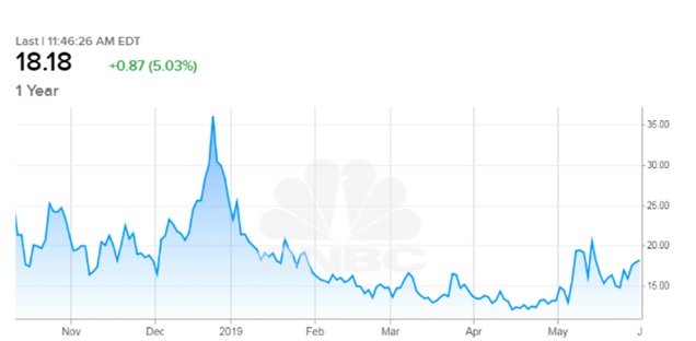
To elucidate, the above stock chart shows a horizontal line, which is the X axis, that represents the time period. The vertical line, which is the Y axis, denotes the price of a stock or trading volume in that particular period.
Likewise, the trend lines fluctuate within these axes, and based on this, the stock charts are categorised as:
Types of Stock Charts

- Point and Figure charts – The marking of high and low stock price is indicated with X’s and O’s, respectively. On the vertical axis, when the stock price goes up, it is marked as a column of X, and when it falls, it is marked as a column of O.
- Candlestick charts – The price movement of the stock is shown in the shape of a candle. Here, a rectangular block signifies the opening and closing stock price. On each side of the rectangular blocks, there is a thin line extending upward and downward. The line going upward reflects the highest trading price, and the line going downward shows the lowest trading price in the given period.
- Bar charts – The horizontal line moving towards left and right indicates the opening price and closing price of the stock, respectively. The vertical line moving upward and downward manifests the highest and the lowest price the stock traded in the day, respectively.
- Line charts – There is a formation of line within the dots, and the last dot shows the closing price of a stock in that given period.
How to read stock market charts?
- You first need to identify the type of stock chart you are analysing. Post that, look for a symbol or ticker designation which acts as an identifier of a company.
- While analysing a chart, set a time frame to get the required data – the timescales could be anything from daily, weekly, monthly or yearly. These timescales could help in identifying short-term and long-term trends in stock price.
- Almost every chart has a summary key, which should at least give details like the last price of the index, the volume traded, and the price moving averages. The summary key is usually at the top left corner of the chart.
- The upper part of a chart always shows the fluctuations in the price of a stock over a particular period. These fluctuations are generally colour coded, with each colour demonstrating a particular trend in the stock price.
- The bottom of a stock chart will have a crucial indicator of the momentum in the market – the volume traded. Just like price fluctuations, the volume traded bars could also be colour coded. This portion of the chart helps to analyze the total number of stocks traded between the buyer and seller during a specific period.
- Moving average refers to the average fluctuations in the price of the stock within a specified period. Moving averages can be a vital tool when it comes to stock analysis. Each type of chart has a different way of indicating moving averages and you might also be able to select different averages to analyse.
Stock charts and you – How to make smart investment decisions?
Understanding the nitty-gritties before you begin your stock market investment journey might get overwhelming for some investors. If you are one of those, getting in touch with an expert could be the way for you. Exploring tailormade investment plans through a trusted, reliable financial advisor could aid you in your personal finance journey.
Comments are closed.